
Fundación Alberto Motta
This was a fun project for an NGO works with other organizations on five pillars: education, health, culture, environment and housing. Their website was already on Wordpress with all the content created, so we started out with a good starting point.
First thing we researched for them was a mood board, collecting design references for color palettes, photography styles, typography and other design elements. That helped us a lot to pin point a design direction for the new website.
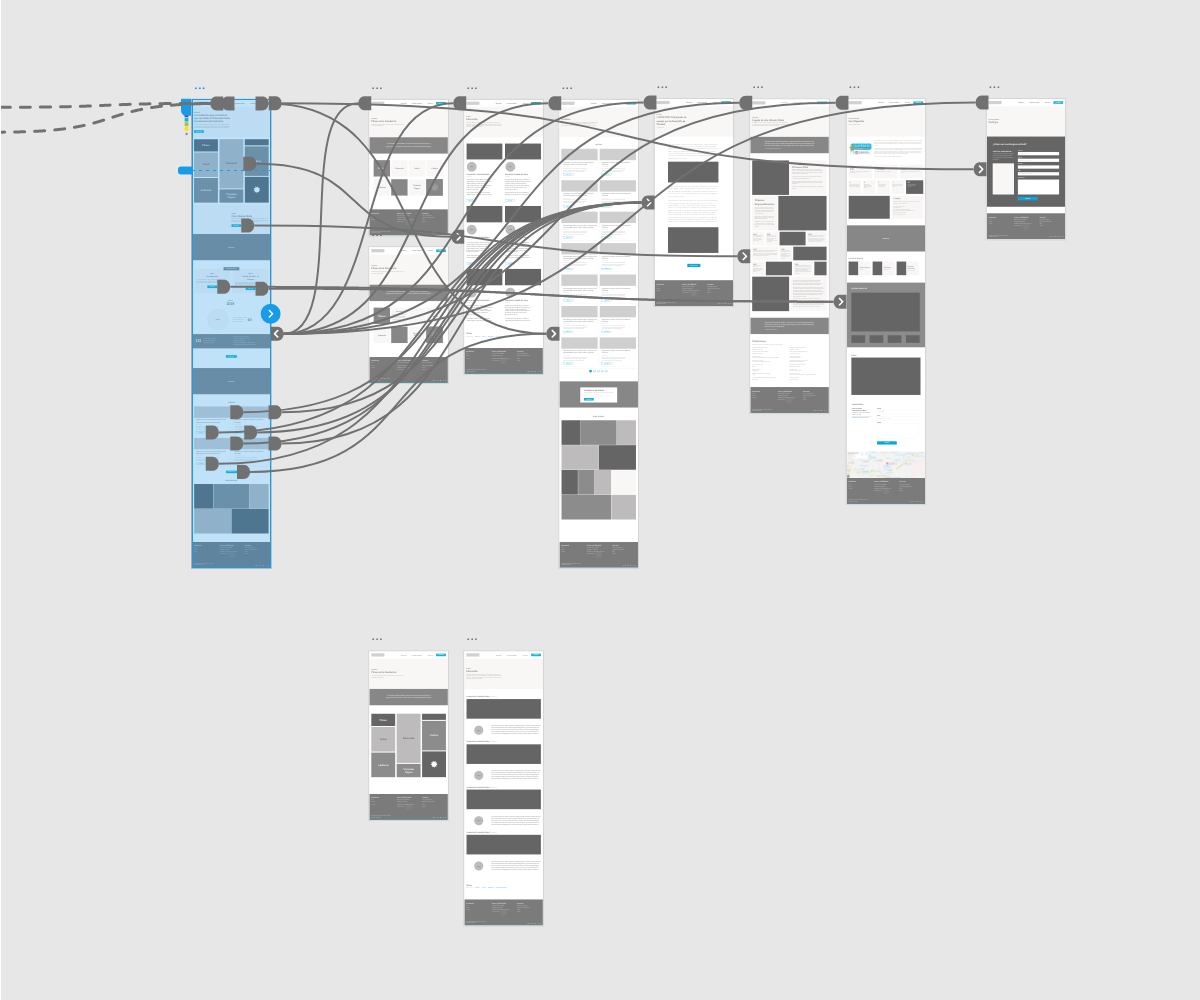
Wireframing to get a better understanding
Sometimes wireframes are more helpful for your own personal discovery and understanding of the project than a deliverable for the client. In this case, they helped me get an idea of the design direction I wanted to take with the project and the design elements we will have to code later on, things like the grid elements that would be loaded via ACF fields on Wordpress.
One benefit of designing these on Adobe XD is that you can quickly build a functional prototype that can be browsed by yourself or the client to better understand the hierarchy and organization of the website. And you have a starting point with everything already layout to work on the visual design, so you don't have to start from scratch.
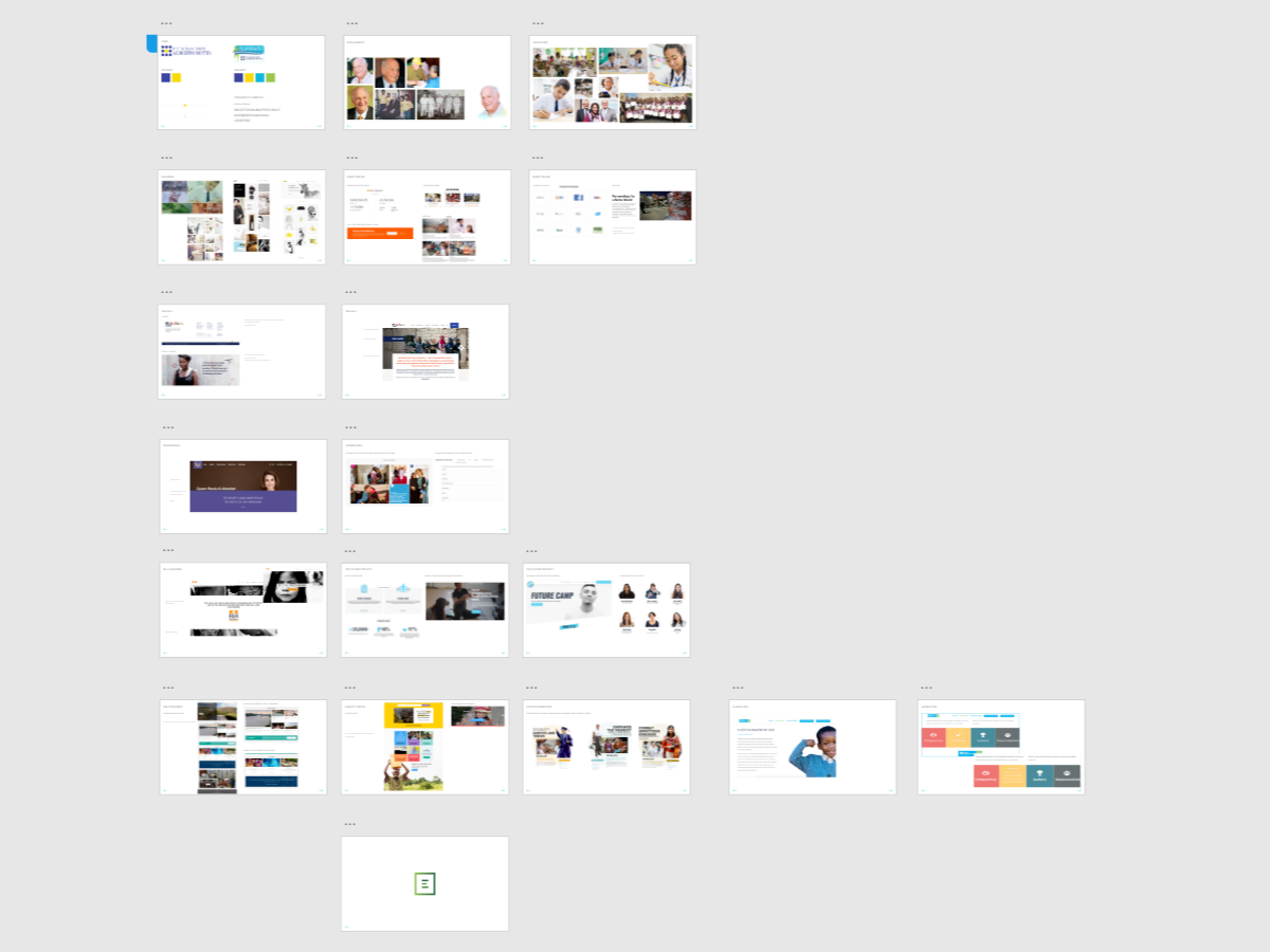
Here are some close ups of the grid columns, the darker squares represent photos. I'm also having a "cards phase", I kind of love them and should stop re-using them.. but still, I really like how organized and clean the blog section looks with the card design... very "Material Design-esque".
Visual Design with Token Studio
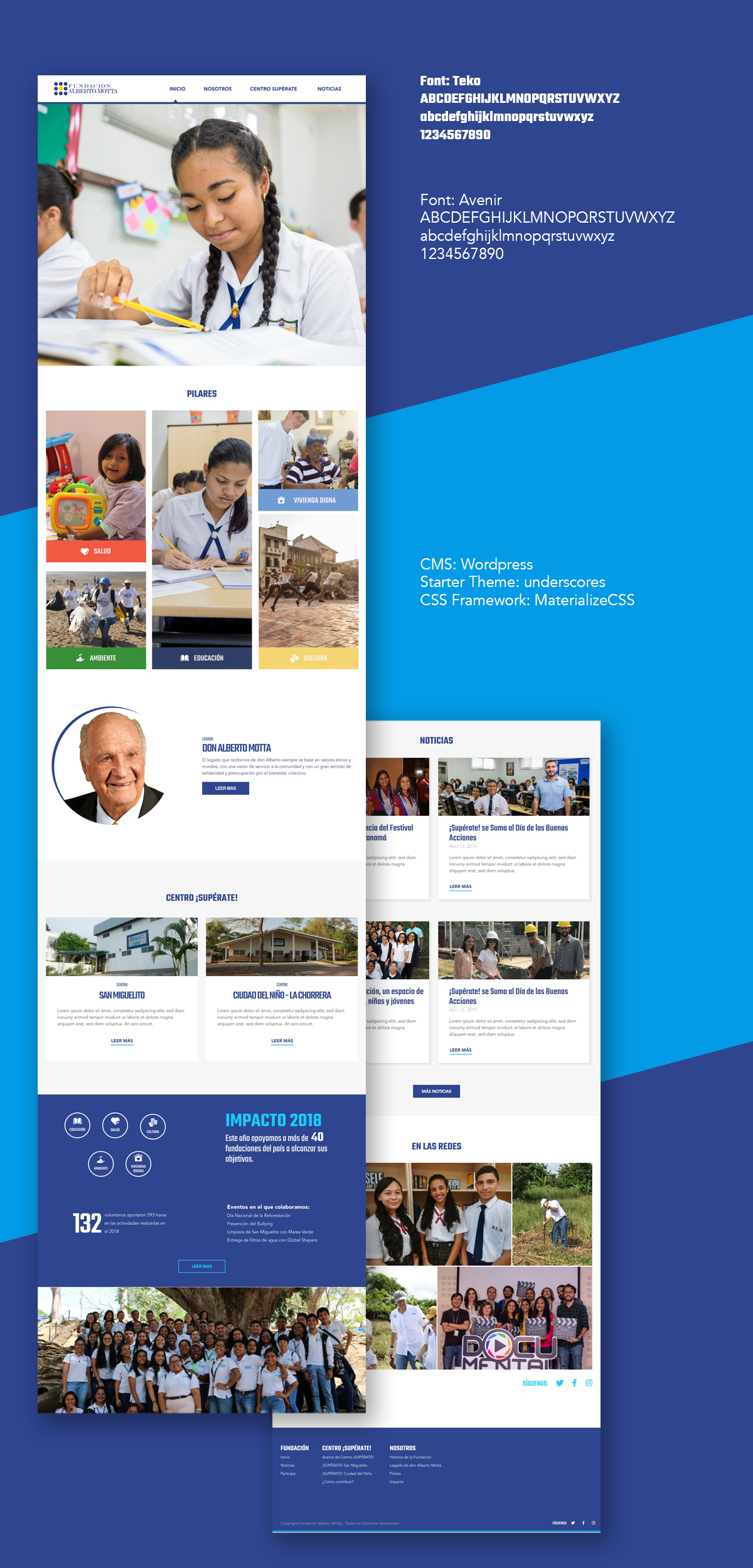
We had the opportunity to collaborate on this project with our friends from Token Studio, Juan Carlos Marin and Elsa Canto to create a pleasing and elegant design. After a couple of iterations, we arrived at an approved version of the design by our client, showcasing all the initiatives the NGO works on a very clean interface.
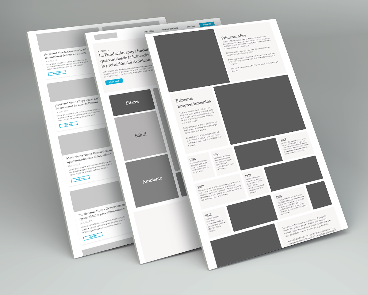
Here you can see the same layouts we saw as early wireframes, but with actual content and pictures. The mosaic or grid and card design helps present a very clean and organized layout with high content density, without feeling too crowded.

Implementation
Bootstrap has become the go to CSS framework, at least for me and most designers I know. But sometimes it feels a little bit too cumbersome with it’s overabundance of nested elements and plethora of CSS classes; so I have been looking for an alternative for some time.
I discovered Materialize CSS, a CSS framework based on Google Material Design concepts. What I really liked about Materialize CSS is the simplicity of the markup to create similar elements that previously took a longer patch of HTML to achieve in Bootstrap. The concepts for the columns or other visual elements and the class names are very similar to Bootstrap, so it’s very easy to to start using it right away.
Anyways, I coded all the layouts on static HTML/CSS based on Materialize CSS and then coded everything on Wordpress, using underscores as the starting template and just integrating my HTML instead of hacking another theme to make it look like our designs.
